Explanation
A solar diagram shows the position (and in general, the trajectory) of the sun at a given time of day, for a given day of the year. It answers the questions:
- Where is the sun in the sky?
- How high in the sky is the sun at noon?
- When does the sun rise and set?
- How many hours of sunlight are there in January?
- How different (in terms of sunlight) is a day in summer from a day in winter?
As you might expect, the answers differ depending on where you are on Earth.
Reading the diagram
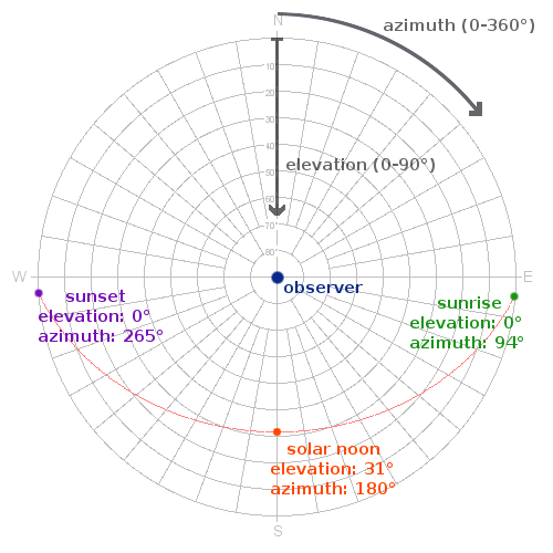
Suppose there is an observer somewhere on Earth. A solar diagram is then a chart of where the observer sees the sun in the sky, how high (elevation) and in what direction he has to look (azimuth).
This diagram shows the sun's trajectory during some particular day of the year. Along the trajectory (the red line) there are particular points of interest:
- The sun rises in the East. This is shown in the diagram by the fact that the angle of elevation exceeds 0°.
- The sun sets in the West. This means the angle of elevation drops below 0°.
- The highest elevation of the sun in a day is called the solar noon.

Let us now look at a complete diagram.
Case study: Copenhagen
A complete diagram shows not only the trajectory for a single day, but also the trajectories for certain characteristic days of the year:
- June 21 is the summer solstice and the longest day of the year in the Northern Hemisphere (shortest in the Southern).
- December 21 is the winter solstice and the shortest day of the year in the Northern Hemisphere (longest in the Southern).
A number of days in between are also plotted.
Each hour of the day is plotted, showing how the sun's position changes over the course of a year. This is called an analemma curve.
Any position plotted in the first half of the year appears in blue, while any position in the second half appears in green. In addition, for timezones that use Daylight Saving Time (DST), any position during daylight saving time is shown in a lighter shade of the same color. Labels indicating Daylight Saving Time (DST) and Standard Time (ST) are also shown.

In the case of Copenhagen we can see that summer days and winter days differ dramatically in the amount of sunlight (17 hours vs 7 hours at the most). Moreover, the sun reaches a much higher elevation in summer than it does in winter.
The selected point (the red dot) is 11:00 standard time (12:00 daylight saving time) on October 3.
